EnsoGrow – Personal AI Garden Companion
Personal AI Garden Companion
Motivation
Home growers need guidance that fits their space, time, and organic-first goals. We wanted to make gardening feel approachable, encouraging, and grounded in local context so people actually stick with it.
Solution
EnsoGrow blends AI guidance with a simple, calming interface so users can move from curiosity to confident care. The experience is built around short, actionable steps instead of long, intimidating instructions.
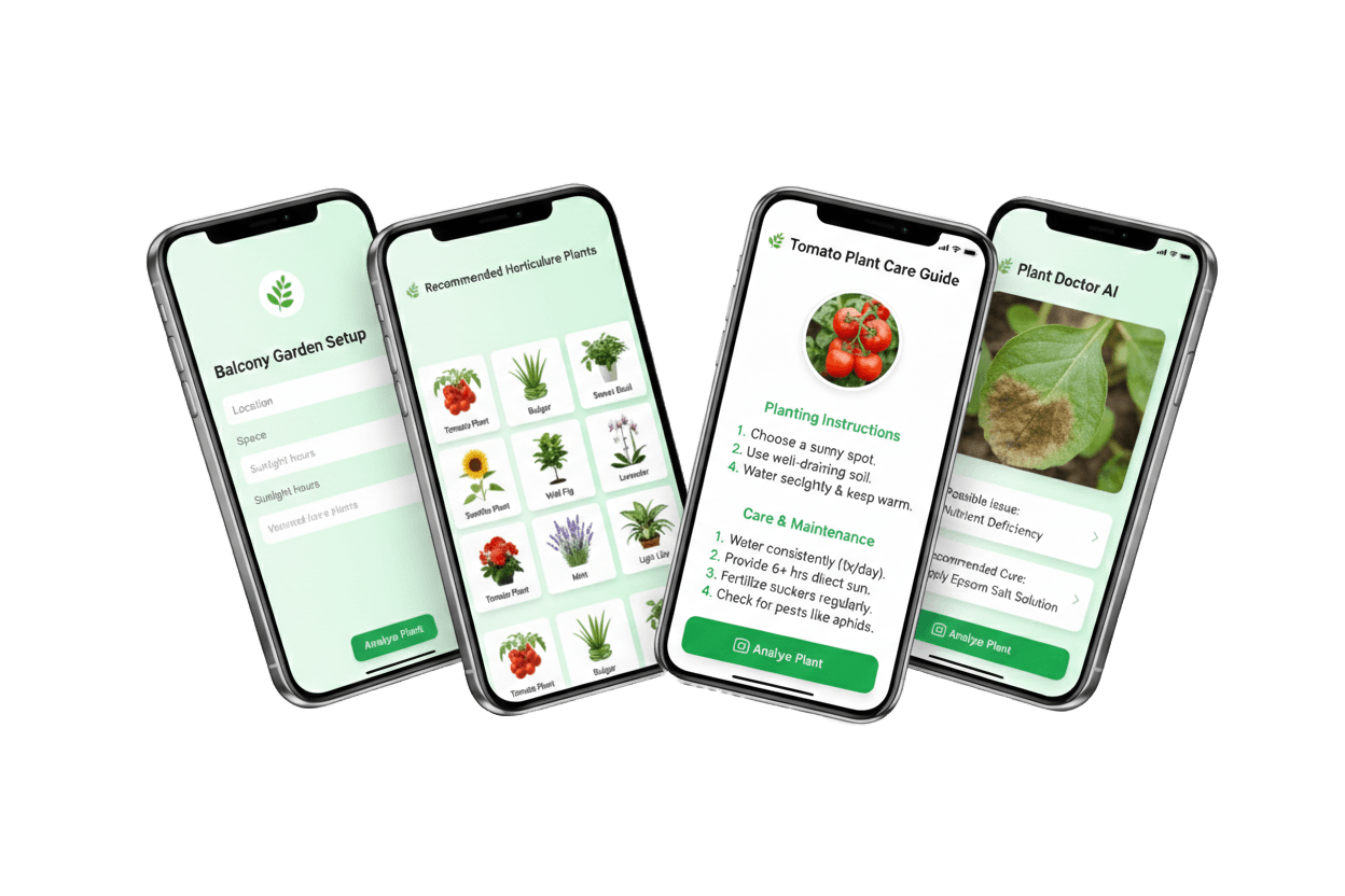
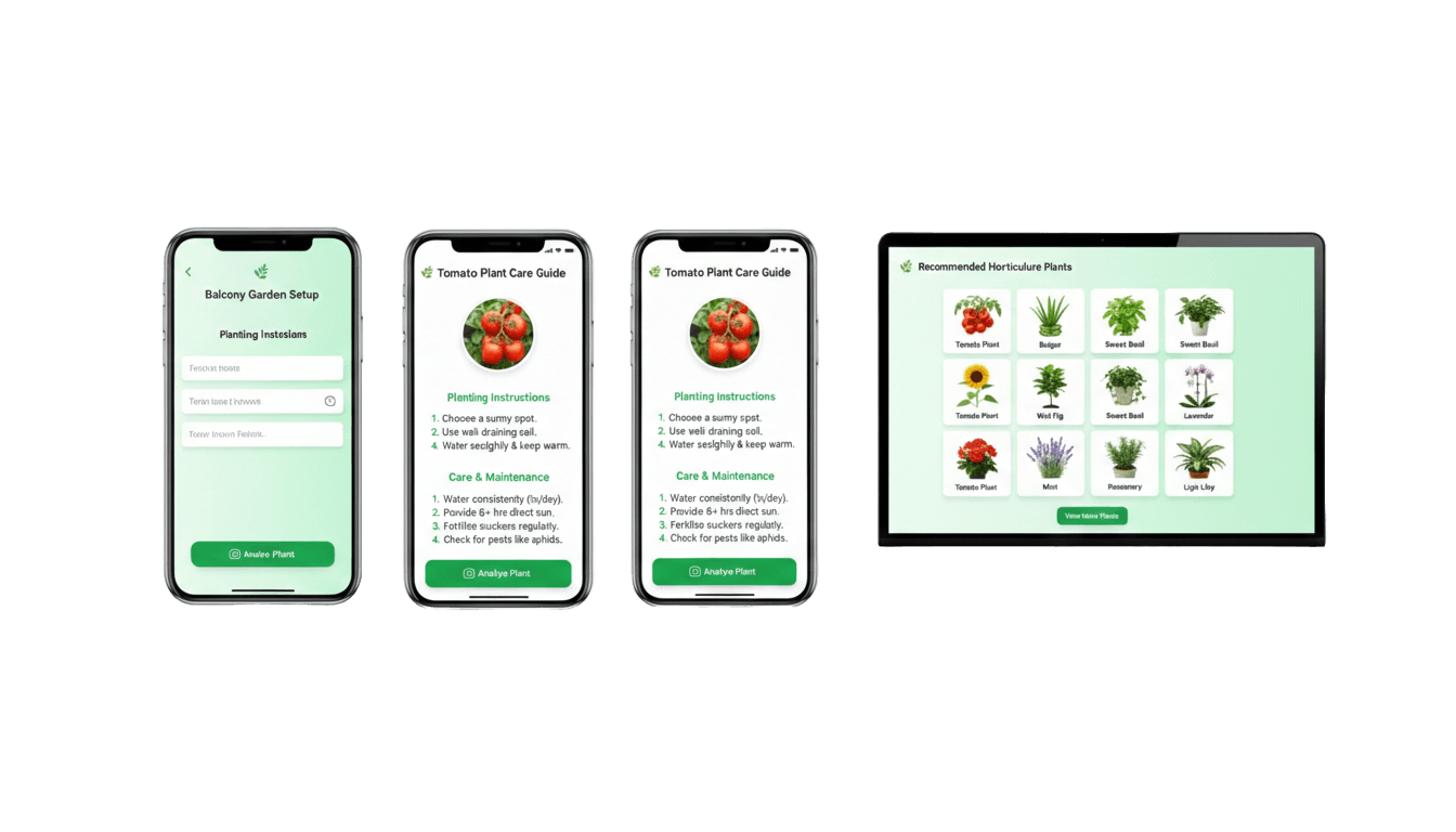
- Personalized onboarding maps each user’s space, light, and time into a garden profile that drives every recommendation.
- Instant plant care diagnostics turn a photo into clear, organic-first treatment steps and recovery guidance.
- Adaptive schedules translate growth stages, local weather, and routines into lightweight reminders that are easy to follow.
- Motivation loops keep users engaged with progress visuals, milestones, and community-driven encouragement.
- Plant Matchmaker – Tailored plant picks based on space, sunlight, and time commitment.
- AI Plant Doctor – Snap a sick plant for instant diagnosis and organic treatment tips.
- Care Reminders – Adaptive nudges based on growth stage, weather, and schedule.
- Gamified Tracker – Visual growth timelines and milestone badges to keep momentum.
- Hyperlocal Community – Connect nearby gardeners for compost pickups, seed swaps, and tips.
- Ask‑Me‑Anything Bot – AI chatbot trained on gardening forums and agri‑research.
Design Process
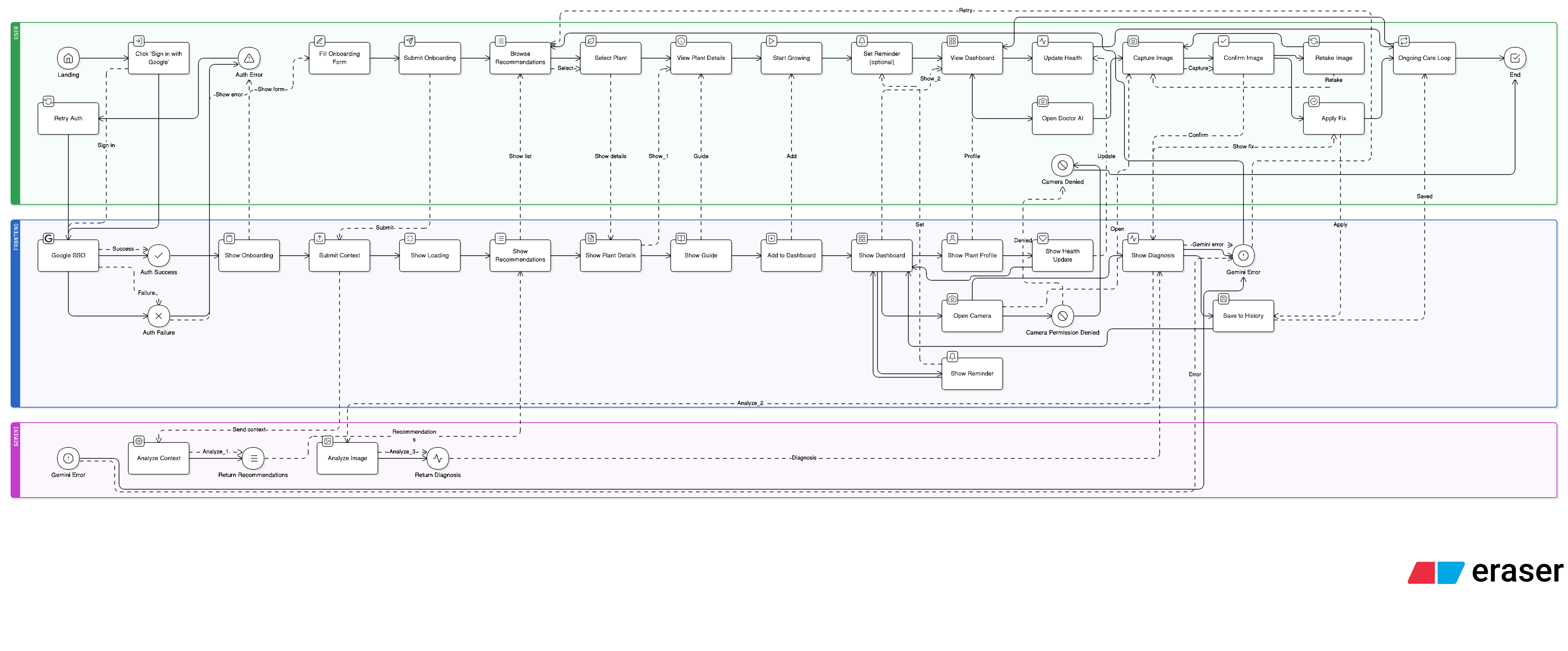
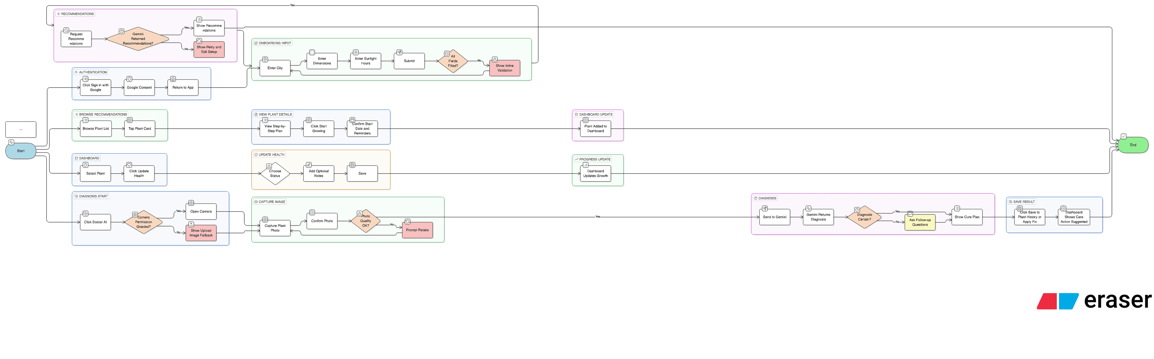
Built during WildHacks 2025 as a rapid PWA prototype, we focused on clarity-first flows, lightweight interactions, and AI-assisted guidance that could be tested quickly with real users.
Empathize
We studied how beginners and casual growers actually behave day‑to‑day — when they check plants, how they remember tasks, and what makes them give up. Interviews and quick shadowing sessions revealed that most users want guidance that fits their space and schedule, not generic advice.
Why this mattered: the early drop‑off wasn’t about a lack of information, it was about overwhelm. By learning the emotional curve of a home grower (excitement → confusion → frustration), we shaped a tone that is supportive and action‑oriented.
How it helps: this phase ensures the product feels like a coach rather than a manual. Every later feature (diagnosis, reminders, progress) is grounded in real constraints and real routines.
We focused on the emotional journey of home‑growing. The research showed that beginners abandon plants when advice feels generic or too complex. We listened for what users actually do day‑to‑day, not what they say they will do. This phase helped us design a calmer tone, simpler steps, and a faster path to visible progress so users build confidence early.
- Interviewed first‑time and casual growers about their routines, schedules, and decision fatigue.
- Captured constraints around space, light, and time that break typical app guidance.
- Documented emotional triggers—loss of confidence after failed plants and lack of feedback.
- Benchmarked competitor apps to identify what felt overwhelming or too generic.
Define
We synthesized findings into a clear problem statement: people abandon plants when guidance ignores their context. The system must recognize space, light, time, and organic preferences before giving advice.
Why this mattered: a feature‑heavy product would add more pressure. We needed a minimal set of actions that a user could complete in minutes and still feel progress.
How it helps: defining outcomes like “keep a plant healthy for 2–3 weeks” translated into practical design choices — simple onboarding, clear next steps, and confidence‑building progress indicators.
We framed the challenge around context‑aware guidance: users don’t just need plant facts, they need advice tuned to their space, time, and organic‑first preferences. By defining outcomes in real‑world terms (healthy plants, reduced confusion), we shaped a solution that prioritizes actionable guidance over information overload.
- Synthesized interviews into a clear problem statement rooted in context, not just features.
- Prioritized pain points by frequency and severity to avoid feature overload.
- Converted findings into product requirements for onboarding, reminders, and diagnostics.
- Defined success as ‘users can keep a plant healthy for 2–3 weeks’ not just app usage.
Ideate
We explored multiple concept directions — from a lightweight daily coach to a community‑first platform. Sketching and flow mapping helped us pick the moments where users needed the most help.
Why this mattered: the best ideas were not the flashiest; they were the ones that reduced cognitive load. We focused on quick actions (photo diagnosis, 1‑tap reminders) that fit into busy schedules.
How it helps: the ideation outputs became a set of flows that deliver value in under one minute, which is critical for retention and repeat use.
We prioritized ideas that reduce cognitive load and deliver immediate value — short tasks, photo‑based help, and ambient reminders instead of long reading. This ensured the product feels like a helper, not another commitment competing for time.
- Explored multiple flows for onboarding: quick quiz, photo‑based setup, and hybrid models.
- Prototyped AI use‑cases for diagnosis, reminders, and an ask‑me‑anything assistant.
- Designed a lightweight community layer to support hyperlocal seed swaps and advice.
- Selected concepts that deliver value in under one minute per session.
Design
We translated the flows into mid‑fidelity PWA screens with an emphasis on clarity. The interface uses calm spacing, minimal friction, and a consistent information hierarchy so users always know the next step.
Why this mattered: the design had to reduce anxiety. We avoided dense content blocks and used visual progress (timeline + milestones) to reinforce small wins.
How it helps: the UI makes it easy to act — users can diagnose a plant, see a recovery plan, and set reminders without digging through menus.
The UI favors clarity and reassurance. Every screen reinforces a sense of progress and makes it easy to complete one helpful step at a time. We chose a minimalist layout so users can act quickly, which is crucial for busy students and professionals.
- Built mid‑fidelity PWA screens emphasizing clarity, calm spacing, and gentle prompts.
- Created a visual growth timeline to show progress and reduce drop‑off.
- Designed the plant doctor flow to translate diagnosis into a 3‑step recovery plan.
- Simplified navigation so key actions are always one tap away.
Test
We ran rapid demos and short usability checks with hackathon participants and mentors. We observed whether users could complete setup and understand their next action without guidance.
Why this mattered: testing validated the assumption that short guidance beats long explanations. Users asked for confirmation and simple reminders, which informed our copy and UX tweaks.
How it helps: the refinements improved clarity, reduced confusion, and strengthened retention drivers like reminders and visible progress.
Testing confirmed that guided onboarding and short feedback loops are key to retention. Users responded best to clear next steps and visual progress, so we strengthened reminders and the timeline. This makes the product helpful, not burdensome, and keeps users engaged through early plant care.
- Demoed the prototype with hackathon participants and mentors for rapid feedback.
- Observed setup time and error points to validate a 3‑minute onboarding goal.
- Refined micro‑copy and reminders to reduce confusion and anxiety.
- Validated that users understood next actions without reading long explanations.
Reflection
Outcomes
EnsoGrow proved that gardening guidance works best when it’s contextual, lightweight, and encouraging. The hackathon build validated our core loop—quick onboarding, clear next actions, and visible progress—while the AI Plant Doctor and reminders emerged as the strongest “aha” moments for users.
If I had more time
With more time, we’d expand testing with a broader set of growers across different climates and living situations, improve the vision model with more labeled plant disease data, and deepen hyperlocal community features (seed swaps, compost pickups, and expert office hours).